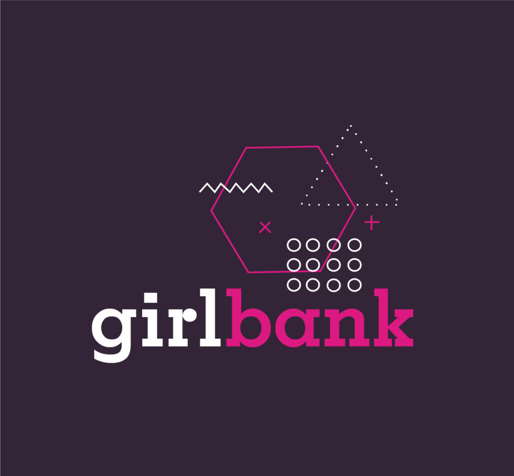
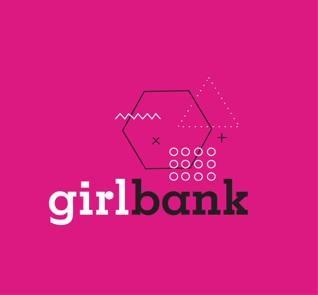
Girlbank is inspired by the Memphis design movement. While still using geometry to challenge orthodox design, the Girlbank branding is more flat and modern. The ‘G’ for Girlbank has been included in the logo by making use of layered memphis elements in thin 1pt contrasting strokes.
Girlbank is a fictional app for an upcoming electronic literature project where users can read through bank transactions. This punchy, mid-century design appeals to the target age of the narrator – a young woman – because of its kitschy energy and its rebellion of the principles seen in more traditional art movements.
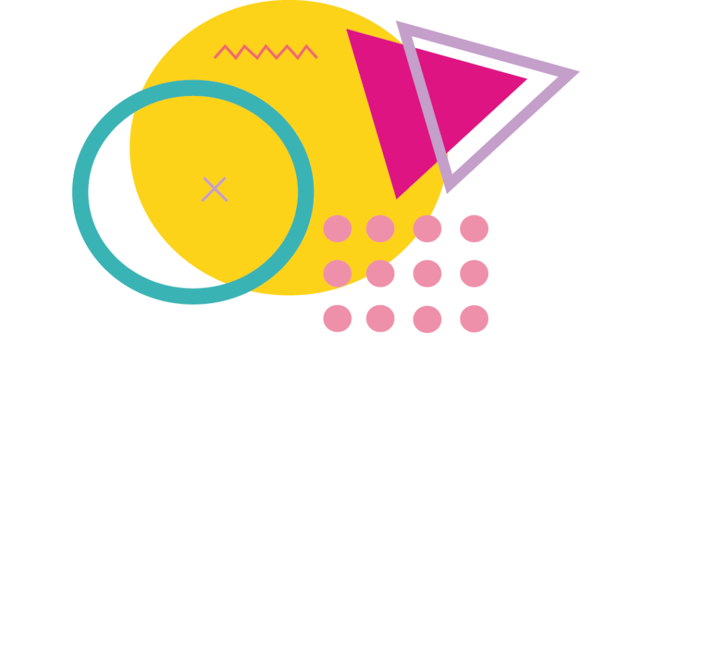
This earlier ideation of the Girlbank logo, explored the use of bright colours and bold lines to show the creativity of the project as an experimental work of fiction. Ultimately this didn’t represent the target audience very well; the bright colours felt too casual for a banking app and, as a result, this design was lacking in trustworthiness. Not what you want from a bank!
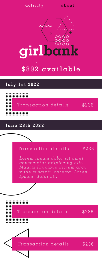
Early prototypes
An early prototype for light mode showing an expanded transaction section with Latin copy where the narrative will be. This drop down includes animation effects on interaction. These mockups have also made use of simple geometric shapes common in Memphis style to divide sections and create focal points for content.